ChartBrick Review: Live Charts from Notion, Airtable & Sheets (2026)
ChartBrick connects 10 data sources, uses AI to build dashboards, and embeds live-updating charts in Notion and websites from €4.99/mo. Our review covers…
Reviewing ChartBrick · Published · 12 min read
Opening
Your Q3 revenue numbers live in a Notion database. Your client wants a dashboard by Friday. You export to CSV, wrestle with Google Sheets charts, screenshot the result, and paste a static image into the report—already stale before they open it.
That loop is why no-code chart tools keep multiplying around Notion, Airtable, and spreadsheets. ChartBrick targets the gap directly: connect a live data source, let AI propose chart types, publish a shareable link or embed that refreshes on a schedule—no Python notebook, no Looker license, no screenshot workflow.
ChartBrick is not trying to replace Tableau for enterprise analytics. It is optimized for operators, freelancers, and small teams who already store truth in Notion or Airtable and need presentation-grade visuals that stay current inside Notion pages, landing pages, and client deliverables.
This ChartBrick review covers data sources, AI chart generation, pricing, embed behavior, who should skip it, and how it compares to Notion-native chart tools and full BI platforms.
Key takeaways
- 10 data connectors: Notion, Airtable, Google Sheets, Stackby, PostgreSQL, MySQL, Excel, CSV, JSON, and REST API.
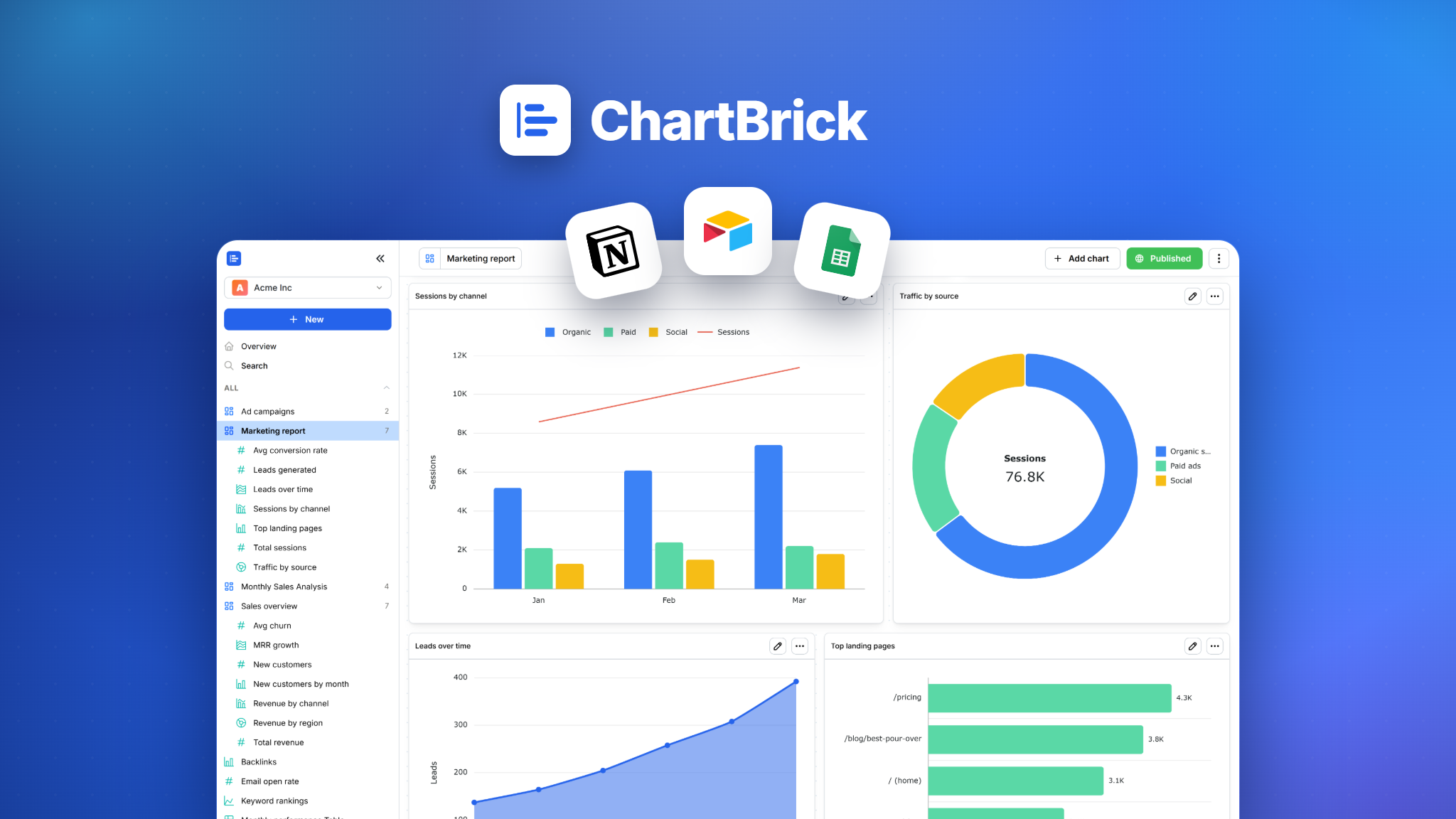
- 20+ chart types including bar, line, area, scatter, heatmap, waterfall, funnel, radar, KPI cards, and data tables.
- AI builds first-pass dashboards from column metadata (not row values)—you edit before sharing.
- Free forever tier: 4 charts, 1 dashboard, 3 datasets; paid Unlimited from €4.99/mo (annual) with branding removal and image export.
- Live embeds for Notion and websites via iframe—charts stay interactive and auto-update.
- Best for Notion-centric workflows and client reporting; weaker if you need warehouse-scale BI, complex SQL modeling, or strict on-prem requirements.
What is ChartBrick?
ChartBrick is a cloud chart and dashboard builder that reads from popular productivity databases and renders shareable visualizations. The product pitch is three steps:
- Connect a dataset (OAuth or credentials, depending on source).
- Generate charts—manually or with AI assistance that picks types from your schema.
- Share via public URL, embed code, PNG/PDF export, or CSV data download.
The company sells through its own site and has run AppSumo lifetime deals, which explains a large volume of buyer reviews praising speed and Notion fit. Marketing emphasizes privacy: credentials and datasets encrypted at rest, no resale of customer data, processors disclosed in the privacy policy.
Use cases on the homepage span personal finance trackers, SEO client reports, habit logs, trading journals, and Notion HQ dashboards—signals that ChartBrick optimizes for individual power users and agencies, not Fortune 500 data teams.
Evaluation methodology
We evaluated ChartBrick by reviewing its live marketing site, pricing page, terms of service, AppSumo listing, and published user testimonials. We did not run a paid Unlimited subscription or stress-test database connectors with production credentials during this review. Connector behavior, refresh latency, and AI chart quality can vary by source size and API rate limits—validate with your own dataset before client-facing launches.
Product overview
Data sources and connectivity
ChartBrick supports ten ingestion paths, which is broader than many Notion-only competitors:
| Source | Typical use |
|---|---|
| Notion | Team wikis, CRM-lite databases, content calendars |
| Airtable | Agency ops, inventory, project trackers |
| Google Sheets | Lightweight team metrics, ad-hoc models |
| Stackby | Spreadsheet-database hybrids |
| PostgreSQL / MySQL | App metrics, internal reporting |
| Excel / CSV / JSON | One-off imports and exports |
| REST API | Custom backends and webhook-fed tables |
Terms of service require that you only connect sources you are authorized to access—relevant for agencies wiring client credentials. Credentials live encrypted on ChartBrick's side; you still inherit data-processor obligations if client PII flows through charts.
AI chart generation
ChartBrick's AI reads column names and types, not individual row values, then proposes up to four charts per dashboard, each answering a different question with an appropriate visualization. That design balances speed with a defensible privacy story—you should still review every chart before external sharing, because AI can misread column semantics (e.g., treating a categorical ID as a continuous metric).
Paid Unlimited unlocks full AI generation; the free tier offers limited AI usage (exact caps may change—confirm on signup). Manual editing remains available: resize on a grid, recolor, swap chart types, refresh all widgets in one click.
Chart types and customization
The catalog exceeds basic bar/line/pie:
- Comparison: bar, column, combination, waterfall, histogram
- Trend: line, area, scatter, bubble
- Part-to-whole: pie, donut, Nightingale, radial bar/column
- Specialized: heatmap, funnel, cone funnel, pyramid, radar
- Summary: KPI cards, data tables
Styling is click-based—themes, palettes, sizes—without CSS or D3 knowledge. Testimonials consistently highlight aesthetic defaults ("beautiful," "clean interface") as a reason they chose ChartBrick over exporting from Sheets.
Sharing, embeds, and auto-refresh
Two distribution modes matter for buyers:
- Public link — full dashboard or single chart in the browser.
- Embed snippet — iframe for Notion, Webflow, WordPress, or custom sites.
Embeds stay interactive (hover tooltips, series toggles) and sync with source data on a schedule you configure—hourly, daily, or weekly depending on plan and connector. That is the core value over static screenshots.
Unlimited adds PNG chart download and PDF dashboard export for decks and email attachments where iframes are awkward.
Security and privacy posture
ChartBrick states that datasets, credentials, and passwords are encrypted at rest, with subprocessors listed in the privacy policy. AI output is provided as-is; terms place review responsibility on you before relying on AI-chosen chart types for regulated or client-facing decisions.
There is no advertised SOC 2 badge on the marketing site at time of review—appropriate for a small SaaS chart tool, but enterprise security questionnaires may require follow-up with the vendor if you embed charts on a corporate intranet.
Who should use ChartBrick
- Notion power users building personal or team dashboards without leaving the Notion ecosystem.
- Freelancers and agencies shipping recurring SEO, ads, or ops reports where a live client link beats emailed PNGs.
- Solo founders tracking KPIs from Airtable or Sheets on a landing page embed.
- Lightweight analytics on Postgres/MySQL without standing up Metabase or Grafana.
- AppSumo / lifetime-deal buyers who want unlimited charts at a flat upfront cost (when available).
Who should wait
- Enterprise BI teams needing row-level security, semantic layers, and warehouse-scale queries.
- Heavy SQL analysts who live in dbt + Snowflake—ChartBrick is not a replacement for Looker or Mode.
- Air-gapped or strict on-prem environments that cannot use cloud chart processors.
- Free-tier-only users needing more than 4 charts / 3 datasets without upgrading.
- Teams uncomfortable with AI-generated defaults who will not audit charts before publishing.
Pricing and value
ChartBrick publishes simple two-tier pricing (EUR-denominated on the live site):
| Plan | Price | Limits | Notable features |
|---|---|---|---|
| Free | €0/mo | 4 charts, 1 dashboard, 3 datasets | Share/embed with ChartBrick branding; limited AI |
| Unlimited | €4.99/mo (billed €59.88/yr, ~50% vs monthly) | Unlimited charts, dashboards, datasets, embeds | Full AI, PNG export, remove branding, priority feedback |
Monthly billing runs higher (~€8.99/mo per third-party listings—confirm at checkout). Cancel anytime; downgrade from Unlimited to Free may require trimming assets to free limits (see FAQ on site).
Value judgment: At under €5/mo annually, Unlimited is inexpensive versus Notion2Charts (~$8.99/mo cited on comparison sites) and orders of magnitude cheaper than BI suites. The free tier is genuinely useful for proof-of-concept—not a crippled trial. Lifetime AppSumo deals (when active) can beat subscription math for long horizons; check redemption windows (60-day code redemption, 60-day refund policy on AppSumo).
Stripe processes payments; ChartBrick does not store card numbers. No refunds on partial subscription periods except billing errors—evaluate on Free first.
Editorial ratings
These scores reflect Launchpadly's editorial judgment from product research and category fit—not an aggregated user rating unless noted.
| Category | Score |
|---|---|
| Ease of use | 4.5/5 |
| Value for money | 4.5/5 |
| AI chart builder | 4/5 |
| Auto-refresh & embeds | 4.5/5 |
| Data source breadth | 4/5 |
| Overall editorial rating | 4.4 / 5 |
ChartBrick's strongest public signal is AppSumo reviewer volume praising speed and Notion embeds—we did not independently verify aggregate star scores on G2 or Capterra.
Pros and cons
Pros
- Broad connector set (10 sources) vs many Notion-only chart apps.
- Live embeds that update on a schedule—core differentiator from screenshot tools.
- 20+ chart types including funnel, heatmap, waterfall, and KPI cards.
- AI accelerates first dashboard without reading raw row data.
- Generous free tier and low Unlimited price on annual billing.
- Clean, modern UI consistently praised in AppSumo reviews.
- Export options (PNG, PDF, CSV) on paid plans for offline deliverables.
- Encrypted credential storage and clear terms on authorized data access.
Cons
- AI output requires human review—column misinterpretation can mislead viewers.
- Free plan branding on embeds may look unprofessional for client work.
- Not enterprise BI—no advanced governance, SSO, or warehouse modeling.
- Usage policy reserves right to limit abusive embed traffic on "unlimited" plans.
- EUR-first pricing may confuse US buyers until checkout clarifies USD equivalent.
- Smaller brand than Google Sheets or Notion native—fewer enterprise case studies.
- Lifetime deal availability varies—subscription path is the long-term default.
Real use cases
A Notion-based content agency connects each client's editorial calendar database, AI-generates a four-chart dashboard (published vs draft, channel mix, owner workload), and embeds live iframes in the client's Notion portal—replacing monthly static screenshots.
A indie SaaS founder pipes Postgres signup metrics into ChartBrick, embeds a MRR trend line on the public landing page, and sets daily refresh so investors see current numbers without engineering time.
A personal finance tracker in Airtable powers net-worth and spending donut charts on a private Notion page—free tier sufficient for four core visuals.
An SEO freelancer exports client Search Console CSVs, uploads as datasets, builds waterfall charts for ranking changes, and shares PDF exports in email while keeping the interactive link for retainers.
How it compares
| Tool | Focus | ChartBrick advantage | ChartBrick gap |
|---|---|---|---|
| Notion2Charts / Notion Charts | Notion-only embeds | More sources + AI dashboards | Notion purists may prefer native simplicity |
| Google Sheets charts | Free, familiar | Prettier defaults + live embed anywhere | Sheets still wins for pure spreadsheet modeling |
| Metabase / Grafana | Technical BI | Faster setup for non-engineers | Depth, SQL governance, self-host options |
| Canva / screenshots | Design | Live data, auto-refresh | Less pixel-perfect graphic design control |
| Airtable Interface | Airtable-native UI | Cross-source dashboards + public embeds | Airtable wins inside Airtable-only teams |
ChartBrick's honest sweet spot is "good enough, good looking, live" charts for knowledge-work data—not petabyte analytics.
Verdict
ChartBrick solves a narrow but painful problem: your data already lives in Notion or Airtable, and stakeholders still deserve live charts without a BI project. The product delivers on that promise with an unusually approachable UI, credible connector breadth, and pricing that makes Unlimited an easy yes for anyone billing clients for reporting.
We recommend starting on the free plan with one real dataset, generating an AI dashboard, embedding it in a private Notion page, and watching refresh behavior for a week. Upgrade to Unlimited when you need branding removal, PNG/PDF export, or more than four charts. Treat AI output as a draft—spend five minutes validating axes, filters, and chart types before client links go out.
Skip ChartBrick if you need enterprise semantic layers or on-prem compliance out of the box. For everyone else tired of screenshot dashboards, it is one of the stronger Notion-adjacent chart platforms in 2026—especially at €4.99/mo annual.
FAQ
What data sources does ChartBrick support?
Notion, Airtable, Google Sheets, Stackby, PostgreSQL, MySQL, Excel, CSV, JSON, and REST API—ten connectors total. OAuth flows vary by source; database connections require credentials you authorize.
Is the free plan really free forever?
Yes, per ChartBrick's pricing and FAQ. The free tier caps 4 charts, 1 dashboard, and 3 datasets, includes ChartBrick branding on shares/embeds, and limits AI generation. It is designed for evaluation and light personal use.
How much does ChartBrick Unlimited cost?
€4.99 per month when billed annually (€59.88/year, about 50% savings vs monthly). Monthly billing is higher—check the live pricing page for current rates. AppSumo lifetime deals may offer a one-time alternative when available.
Does ChartBrick work inside Notion?
Yes. ChartBrick provides an iframe embed snippet that renders live, interactive charts inside Notion pages (and other sites). Charts update when your scheduled refresh runs—not static images.
How does AI chart generation work?
AI inspects column names and types (not row values) and proposes up to four charts with suggested types. You can accept, edit, or rebuild manually. You are responsible for reviewing accuracy before sharing externally.
Can I remove ChartBrick branding?
On Unlimited only. Free-plan shares and embeds display ChartBrick branding. Paid Unlimited removes it.
How often do charts refresh?
You can schedule source refreshes hourly, daily, or weekly (per AppSumo feature list and marketing copy). Embeds and public links reflect the latest synced data after each refresh.
What happens if I downgrade from Unlimited to Free?
You must fit within free-tier limits (4 charts, 1 dashboard, 3 datasets). Charts or datasets above those caps may need deletion or consolidation—confirm current downgrade behavior in account settings before canceling.
Is ChartBrick good for client reporting?
Yes, with caveats. Agencies benefit from public links, PDF export, and live embeds. Use Unlimited for branding removal, audit AI-generated charts before client delivery, and ensure you have legal access to client data sources.
How does ChartBrick compare to building charts in Google Sheets?
Sheets is free and flexible but produces static or Sheets-bound visuals. ChartBrick offers prettier defaults, broader chart catalog, scheduled refresh, and embed-anywhere snippets—worth the subscription if you publish outside Sheets often.
 Quartz Studio
 Broker Relay
 ekstrakt